
So, the previous cover, I tried writing my own title—using a mouse to draw vectors, then fixing them. It took too long so I got bored and the letters didn’t come out thick enough and… so on. I’m sure I’ll revisit making my own fonts again, once I figure out what app I should use on my iPad that will give me vector graphics from my iPencil.
Meanwhile, I took Impact, converted it to vector, and gave it some slants and other oddities. I really, really like how it turned out.
I also removed the background image/texture from the cover to make it simpler. I think it’s pretty rad. Does it look professional? …No… and I can’t figure out exactly what I’m missing. (Other than a blurb.) The arrangement of text, probably, but there are experts who do this for a reason. I will study more later. In the meantime, enjoy.
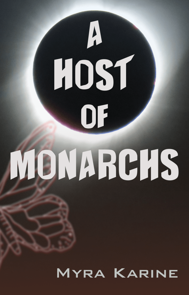
Btw the eclipse is a picture I took, myself, of the Great Western Eclipse of 2017 from Idaho. (With a Canon point-and-shoot with great zoom.) The butterfly I drew myself. Yup. That’s why most of it is cut off. It’s better that way.
Cover created in Sketch.
